Ep. 62 - Helen Frankenthaler's "Madame Butterfly" (2000)

Ep. 62 - Helen Frankenthaler's "Madame Butterfly" (2000)

The Lonely Palette

C1June 7, 202327 min
Play

See the images: bit.ly/3ChhuAE Music used: Django Reinhardt, “Django’s Tiger” The Andrews Sisters, "Bei Mir Bist Du Schoen" The Blue Dot Sessions, “Bedroll,” “A Common Pause,” “Palms Down,” “Desmontes,” “Delamine,” “Greylock,” “Angel Tooth,” “Dear Myrtle” Joe Dassin, “Les Champs-Elysees" Episode sponsor: The Art of Colour: The History of Art in 39 Pigments: bit.ly/43Qp1SJ Support the show! www.patreon.com/lonelypalette Register for our Hub & Spoke live show in Woodstock, VT on June 15...

Transcript

Automatically generated from the audio. May contain errors.

This episode is supported by Yale University Press' The Art of Color, the history of art in 39 pigments. And look, there is a lot to remember when you're studying art history. Names and titles and dates and more dates.

And it's hard to imagine on top of that, knowing the precise historical names for the pigments that Van Gogh used, where or when they were discovered, or the complex processes necessary to make them pallet-ready to create the pulsing power of the starry night. But what if we did know them?

This is the idea behind the new book, The Art of Color, the history of art in 39 pigments by Kelly Grovier. It tells an innovative history of art through the biographies of paints and pigments, helping us understand in a new way how the colors in a given artwork affect us.

Grovier takes readers on an exciting search for the intriguing and the unusual, ultimately enriching our experience of art. The Art of Color, the history of art in 39 pigments is published by Yale University Press and is available wherever books are sold.

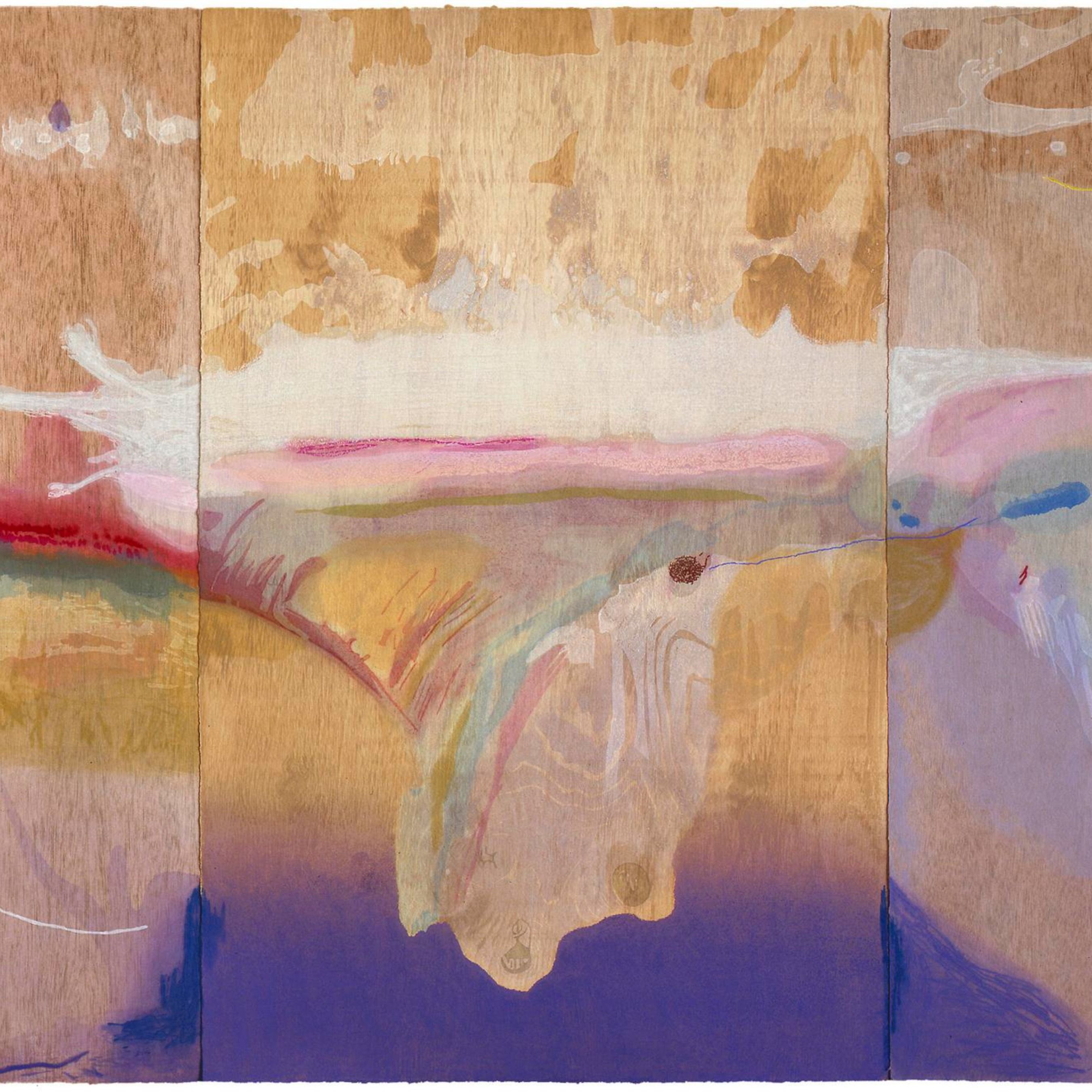
Okay, what am I looking at? I'm looking at splotches. White and pink and purple at the bottom. And it's delicate.

It's an abstract piece. It's not like a Jackson Pollock. It's not aggressive like a Jackson Pollock. But it's light.

And it's ethereal, if that's a word I can use here. It's feminine and it's not imposing. One of the things that immediately jumps out to me is the fact that the piece appears to be a triptych with a center and two wings, which obviously kind of parallels that of

a butterfly. At the same time, the wings are significantly more rough, wood grain texture is much more visible. Obviously there are these kind of splashes of vibrant reds and blues, this wood grain that is almost looks like the raw material of a plywood board. To me it

kind of resembles the camouflage wings, the camouflage gosmer of mobs. The colors Others remind me of a landscape. Obviously a abstracted, blurry landscape, but the pinks of a sunrise or sunset, and the greenish tone of hills on the horizon, and a blue shoreline.

There's something serene about it. Something complex or layered. This is a piece I think you can get a cup of tea or a cup of coffee and spend some time with. This is the Lonely Palette, the podcast that returns art history to the masses one object

at a time. I'm Tamara Vichai. Episode 62, Helen Frankenthaler's Madame Butterfly from 2000. Okay, time to overshare.

So I was a kid who got a lot of nosebleeds and And whether it was due to sleeping near a radiator or dry air or curious fingers, I mean, look, we don't have to solve any mysteries here. But the point is, I got used to the drill of running for a Kleenex or a paper towel, holding my head forward, definitely not backward, you. And waiting.

Gently test sniffing, waiting, dabbing, and dabbing. And as I waited for my nose to dry back up, I couldn't help but enjoy the process of dabbing that paper towel, watching that bright red stain quietly spread through its grains until it reached its natural, subtle stop.

You can see that process better with paper towels than with tissues. I'm sure it won't surprise you that I was the kind of kid who noticed things like that. And you can really see it if you take it to the sink,

stopping up the drain, turning on the faucet, and watching a little drop of blood hit the water and ripple out like paint. And as I got older and my nose got cleaner, so to speak,

there were other functions and fluids that took its place. mascara and menstrual blood and soap bubbles circling the drain, other quote, messy necessary liquids of life

in the words of art critic and friend of the pod, Adam Gopnik. These liquids pooled and stained and swirled and made me see my body as perpetually capable of producing these art-making materials

that could leave an impression on the world. It's gross. I know it's gross, sure. And maybe not something that I'd talk about outside my closed bathroom door, especially to thousands of people, but maybe also kind of beautiful.

Beautiful, as the artist Helen Frankenthaler said in an interview in 1990, is a tricky word, especially in art. Not only can we not pin down what it actually means, we can't even decide whether or not it's even good,

whether it's a worthy thing for art to aspire to be. And beautiful is a word that's been applied to Frankenthaler's work in particular, and for better and worse.

In the 1950s, it was hard enough to be a female abstract expressionist who was both a friend to and a protege of Jackson Pollock, like she was, steering clear, as she must have,

of his hurling material spatter and swinging metaphorical genitals. But to then take these dynamic, masculine, abstract expressionist ideas of form,

fling, energy, and materiality, and make them feminine, soft, beautiful? It's like you're asking to be diminished. Especially by your fellow female painters, who it should be said, were crueler to her

work than any man was. The painter Grace Hardigan sneered that Frankenthaler, notably a member of the Upper Crust, created paintings that looked like they were created, quote, between cocktails and dinner. Joan Mitchell dismissed Frankenthaler

as a quote unquote, codex painter. One of the meanest things you could say to a woman artist trying to keep pace with the big boys of the movement. I mean, it's bad enough to reduce a woman

to her menstrual cycles, but to liken her work to menstrual stains is f***ing savage. There's an extra special place in hell

for women artists who don't support each other, is all I'm saying. But okay, if you're comparing Pollock to Frankenthaler, spatter to stain, then yes, Frankenthaler is going to seem like something passive and residual, something left behind.

But Frankenthaler wasn't trying to keep pace with Pollock, or Hardigan and Mitchell for that matter. Her stains weren't left behind. They were a medium all their own.

Gentle, limitless, intimate, light as air. They evoked runny spills, smudgy traces of life lived, ethereal clouds in the sky, hazy, indistinct horizons.

This is the opening of the episode. Open the player for the full interactive transcript with clickable words, translation and flashcards.

Open full transcript

Audio belongs to its publisher and is played from their feed. Rights holders can request removal — copyright & takedown policy

Episodes · The Lonely Palette